

I’ve been waiting for this. Part of the nothing-burger kerfuffle over the recently leaked draft of the upcoming IPCC report, was a post on the increasingly desperate and delusional WattsUpWithThat “skeptic” site, that demanded an in depth take down by a stats-savvy expert. The redoubtable Tamino has gone above and beyond, and opened an extra large can of whupass, with maybe one of his best posts ever, reposted in entirety here.
Clearly, David Whitehouse has enough rope. To hang himself.
The WUWT blog has a post by David Whitehouse (of the “Global Warming Policy Foundation”) discussing global temperature data. It features this graph (above) from the leaked copy of the not-yet-completed 5th assessment report (AR5) of the IPCC (Intergovernmental Panel on Climate Change)
What’s surprising is that Whitehouse spends so little effort discussing the graph itself. Instead, he chooses to paint a perversely false picture of global temperature change.
For one thing, Whitehouse is indignant about a comparison of the global temperature trend over the last 50 years to that over the last 100 years. As Whitehouse says:
In Chapter 2 the report says that the AR4 report in 2007 said that the rate of change global temperature in the most recent 50 years is double that of the past 100 years. This is not true and is an example of blatant cherry-picking. Why choose the past 100 and the past 50 years? If you go back to the start of the instrumental era of global temperature measurements, about 1880 (the accuracy of the data is not as good as later years but there is no reason to dismiss it as AR5 does) then of the 0.8 – 0.9 deg C warming seen since then 0.5 deg C of it, i.e. most, occurred prior to 1940 when anthropogenic effects were minimal (according to the IPCC AR4).
Why choose 50 and 100 years? Because they’re nice round numbers, that’s why. They also make the point — the temperature trend (estimated by linear regression) really is twice as fast over the last 50 years as it was over the last 100 years.
What’s actually not true is Whitehouse’s claim that “of the 0.8 – 0.9 deg C warming seen since then 0.5 deg C of it, i.e. most, occurred prior to 1940.” It takes some real cherry-picking to do that.
The claim that “most of the warming occurred prior to 1940″ actually originated, as far as I know, in the mendacious “documentary” The Great Global Warming Swindle by Martin Durkin. To support that claim, Durkin simply faked the data.
Whitehouse just makes the claim, as if asserting it somehow makes it true. Let’s look at some actual data, from NASA. The only way to get 0.5 deg.C warming prior to 1940 is to take the difference between the lowest annual average and the highest annual average during that time period:
Taking the difference between the lowest and highest annual averages includes the noise of year-to-year fluctuations, which makes it a false representation of the actual global warming which took place.
You wanna play that game? OK. Let’s take the difference between the lowest and highest annual averages after 1940. That gives a post-1940 warming of 0.85 deg.C.
That puts the lie to Whitehouse’s claim that “most occurred prior to 1940.” But then, using the range-of-annual-averages method gives a total warming of 1.06 deg.C — Whitehouse’s fake 0.5 isn’t even half of that, let alone “most.”
A better characterization of the net warming is to use the extreme values of a smoothed estimate of global temperature:
That puts the pre-1940 warming at 0.34 deg.C and the post-1940 warming at 0.64 deg.C, with a total range of 0.93 deg.C. Again, the pre-1940 warming isn’t even half, certainly not “most.”
If you insist on partitioning the warming between pre- and post-1940 so the two values add up to the total, a fair estimate gives 0.32 deg.C before and 0.61 deg.C after:
Any way you slice it honestly, the pre-1940 warming is not “most” of the total. It’s not even half. It’s more like a third. David Whitehouse’s characterization is a fake.
As for more recent temperature change, Whitehouse’s viewpoint is perhaps best summed up by this statement of his:
So since 1979 we have has [sic] about 16 years of warming and 16 years of temperature standstill.
Really?
First, Whitehouse is pulling an old favorite trick of fake skeptics: equating the lack of statistically significant warming with the lack of warming. If we look at global surface temperature according to the three main data sets (GISS, HadCRUT4, and NCDC), all three show warming over the last 16 years (2012 still has one month to go, but the difference won’t amount to a hill of beans):
Although all three trend lines slope upward, their slopes aren’t statistically significant. But that doesn’t mean they’re not upward. It just means that there’s not enough data in 16 years to tell for sure, statistically speaking, which way they’re going. That always happens — always — when the time span is short.
That’s why fake skeptics like David Whitehouse like to focus on short time spans.
Whitehouse declares that we’ve had “about 16 years of warming and 16 years of temperature standstill.” According to Whitehouse, all the global warming earth has experienced recently was complete by 16 years ago (the end of 1996). Is that really so? Let’s take a closer look at the last 16 years, compared to what happened before that, starting in 1979 (Whitehouse’s choice).
I’ll do a similar exercise to one I’ve done before. I’ll take the data from 1979 (Whitehouse’s starting point) up to 16 years ago (less one month, the end of 1996). Then I’ll fit a trend line with least-squares regression. Then I’ll extend that trend line to the present, to see what would have happened if that trend continued.
If David Whitehouse is giving an honest portrayal of global temperature, then most of the data points from 1997 onward should be below the extended trend line, since the trend will keep rising but according to him, global warming stopped back then.
If we do this exercise using data from NASA GISS, we get this:
Let’s try using the HadCRUT4 data set instead:
Once more into the fray: let’s try using the NCDC data set instead:
Well well … Plainly, it is not the case that most of the data points from 1997 onward are below the extended trend line. As a matter of fact, for all three data sets, every year from 1997 onward has been hotter than expected according to that trend from 1979. There’s only one valid conclusion: David Whitehouse gave a fake portrayal of global temperature.
Thats what fake skeptics do.
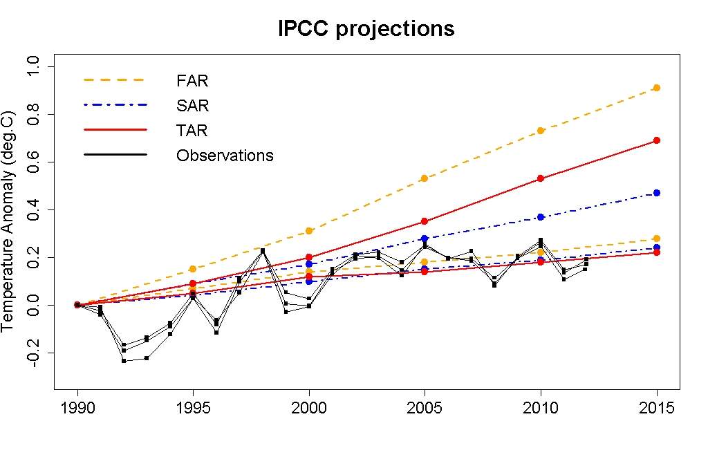
What about the plot from the draft of the AR5 report? It compares projections based on multi-model averages from FAR (first assessment report), SAR (second assessment report), TAR (third assessment report) and AR4 (fourth assessment report) to observations (annual averages) from NASA GISS, HadCRUT4, and NCDC. In my opinion, there is a flaw in how the comparison is done. I don’t suspect it’s an intentional mistake, but I do believe it’s a mistake.
The flaw is this: all the series (both projections and observations) are aligned at 1990. But observations include random year-to-year fluctuations, whereas the projections do not because the average of multiple models averages those out. Using a single-year baseline (1990) offsets all subsequent years by the fluctuation of that baseline year. Instead, the projections should be aligned to the value due to the existing trend in observations at 1990.
Aligning the projections with a single extra-hot year makes the projections seem too hot, so observations are too cool by comparison. This is indeed a mistake — it would be just as much a mistake to align the projections with a single extra-cool year (like 1992), which would make the projections too cool and observations too hot by comparison.
We can estimate the observational fluctuation that by fitting a smoothed curve to the observed data to estimate a nonlinear trend, and noting the difference between the 1990 value and the smoothed value. Doing so indicates that GISS and HadCRUT4 are both about 0.12 deg.C hotter than the existing trend, while NCDC is about 0.10 deg.C hotter.
Fortunately, the draft version of the AR5 report gives the actual data used to plot the projections for FAR, SAR, and TAR (but not for AR4). So, we can make our own version of the comparison. Here’s the comparison as presently done in the report, with all observed series aligned to projections in 1990:
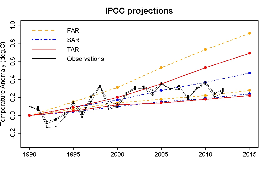
What should be done is to offset the observations so that the hotter-than-average 1990 really is hotter than average. When I offset the observations by 0.1 deg.C, we get more realistic comparison of observations to projections:
It turns out that observed global temperature has gone “right down the middle” of the IPCC projections. But, fake skeptics want you to believe otherwise. That’s what fake skeptics do.
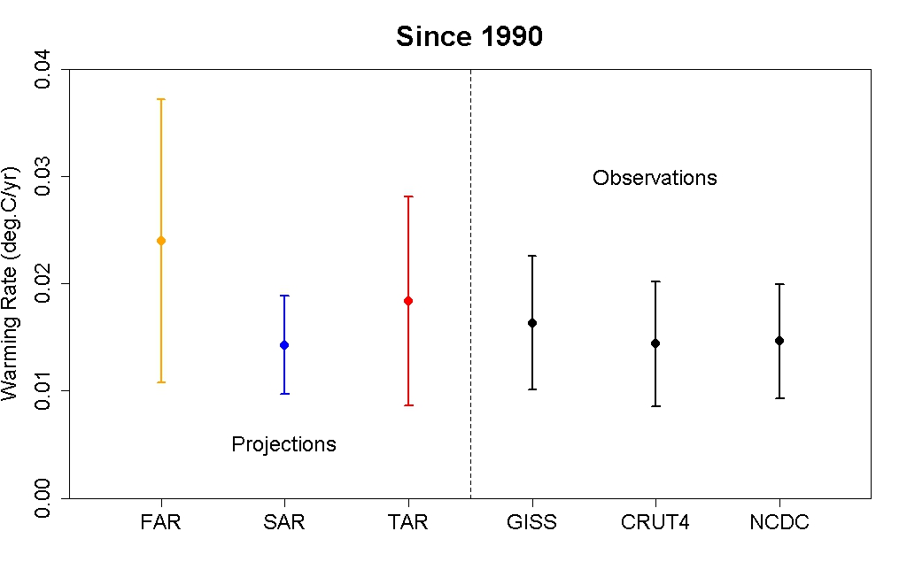
There’s another way we can compare projections to observations from 1990 to the present; we can compute the trend estimated by linear regression. When we do that, we get this:
Once again, observed global temperature has gone “right down the middle” of the IPCC projections.
Yet fake skeptics like David Whitehouse are trying their best to spin the AR5 report (which isn’t even published yet) in order to discredit global warming science. David Whitehouse also chose to paint a picture of global temperature which is as fake as can be.
That’s what fake skeptics do.


Thank goodness someone can explain all this!
Happy New Year Peter and All,
Anthony Watts seems to be interested in picking a fight:
http://tinyurl.com/afj7mo2
Here’s Watts’ tease: “A recent tweet by Bill McKibben thoughtlessly retweeting a statement by the Master of Disaster, Weather Underground’s Dr. Jeff Masters, got me digging to see just how true it was.”
Gibberish ensues. As you’d expect. But it is a high grade of facaca smear, I’ll admit it. 🙂
I believe Tamino is about to publish a book on understanding stats.
Perhaps some of our friends on the Far Side might warrant some belated Xmas gifts?
That whole 16 years thing is just focusing on surface air temperatures, right? But the surface air is just a tiny, tiny portion of the entire earth. I saw a graph on SkS that showed the amount of heat energy the earth is accruing, since 1960. There’s been about 10×10^22 Joules of energy added to the earth from 1995 to 2012. It took us from 1960 to 1995 to grab that same amount of energy. Let me rephrase that: In the last 17 years, the earth has added the same amount of heat energy as it did in the 35 year period before that.
I also did a quick scan over another SkS post that I think went something like:
If you look at FAR, SAR, and TAR runs that most closely followed our actual emissions, they’re pretty much nailing the temps down the middle. Maybe they wouldn’t be so aesthetically pretty if the runs were offset by 0.1C, like Tamino suggests in the re-post above, but then again 1) i didn’t look at the (SkS) article in detail, and 2) being 0.1C ‘off’ is still pretty close.
“figure shows amount of heat the Earth has accumulated since 1960, most of which has gone into the oceans” http://skepticalscience.com/global-warming-lesson-for-monckton-and-co.html …
I’ve made a new year’s resolution:
Like charity skepticism should begin at home: never think that what you believe is right… always test it against the evidence.
Tamino practices this.
Speaking of Anthony Watts, those out there who have wanted to play around with temperature data and see for themselves how easy it is to debunk the Watts and Co claims about the surface temperature record might be interested in downloading this: https://docs.google.com/open?id=0B0pXYsr8qYS6aEFteHZ2SGJ5TU0
It’s a pretty big download (apologies for that), but it encapsulates an entire virtual machine that auto-launches a global-average temperature app integrated with a Google Map front-end.
You can “roll your own” global-average temperature results from both raw and adjusted GHCN data (and compare your results with the official NASA results) with just a series of mouse-clicks. Full documentation can be found at the above link (along with global temperature “virtual machine” file).
This app will definitely help make it clear to users just how incredibly lame all the denier claims about the global-temperature record are.
It should run just fine on any PC or newer Mac (OSX 10.5 or newer) with 2GB+ memory (1GB will work in a pinch — just be sure to close all other apps first).
Here’s a “quickstart” set of instructions.
1) Download the virtual-machine file (about 1GB, sorry about that).
You will need a decent Internet connection for this.
2) Go to http://www.virtualbox.com and download/install the VirtualBox app —
installation is super-easy — just a few mouse-clicks. (You will soon
come to appreciate the true awesomeness of VirtualBox.)
3) Import the virtual-machine file downloaded in step 1 into VirtualBox via
File->Import Appliance… Just accept any defaults (i.e. click “OK”) for any
popup windows that appear. You will need to do this only once (after that,
you will be able to start up and shut down the global-temperature virtual
machine at will — with just a mouse click or two…)
4) Press the VirtualBox “Start” button and wait for the virtual-machine to start up
and the global-temperature app to initialize. For any popup windows that
appear, just click OK or whatever to accept the defaults…
5) When the virtual machine is up and running, you will see a Google Map display of
temperature station locations, along with a popup window with station-selection
controls. (The popup window might be obscured/off-screen, depending on your
system — you might have to look for it).
6) Start clicking on random stations, play around with the popup-window station-
selector controls, etc. After a bit of experimentation, you will see how easy it is
to replicate the official NASA global-warming trend with an amazingly small
number of temperature stations. You will see that raw and adjusted data, rural
and urban stations, etc. all produce very similar results.
7) To exit the virtual-machine properly, right-click on the lighter-colored strip at
the top of the virtual-machine window and select “exit” (at the bottom of the
popup menu).
NASA results are shown in dark blue in the popup global-temperature plot — the app’s raw data results and adjusted data results are shown in red and green, respectively. The upper plot shows temps; the lower plot shows how many of
your selected stations actually reported data for any given year — you can correlate temperature result quality for any time period with the #stations that reported data for that time period.
More details about how to interpret the plotted results are available at the above download link.
Disclaimer: The “virtual machine” implementation that I put together isn’t the most efficient or elegant approach — it was just the easiest way for me to cobble together a reasonably easy-to-use multi-platform “front end” for a crude global-temperature program that I had written previously (with absolutely no advance plans for doing this). This is definitely the product of evolution, not “intelligent design”.
The virtual-machine file is a pig of a download, but it allowed me to bundle everything together all completely pre-configured and ready to run “out of the box” on almost any PC or Mac.
Geez, my office connection is FAST – took about 4 mins ( but many colleagues are still on vacation and it’s after hours )
Quick and fun way to debunk Anthony Watts’ “dropped stations” claim:
On the popup control window, check the “EndYr” and “NumYr” radio-buttons.
Set/edit the controls to show:
EndYr > 2010
NumYr > 100
Yr Select Mode: “And”
Under the “Batch Plot” label, press the “Plot All” button until it reads “Plot Selected”. Then press “Submit” and wait a few seconds.
The upper plot in the plot panel will show results that look almost identical to the results you get when you use all stations. The lower plot will confirm that Watts’ “dropped stations effect” has disappeared.
Just a little something to poke your favorite denier in the eye with.
–caerbannog666 aka that horrible WordPress gobbledygook ID#.
Apologies for the formatting (the line-breaks I put in to improve readability… didn’t).
The Climate Movement activists who reject scientific evidence, such as the measurements that falsify the predicted link between CO2 and accelerated sea level rise, in order to promote the supposed benefits of carbon taxes and resultant high energy prices, are heartlessly condemning the world’s poor to grim poverty:
http://wattsupwiththat.com/2013/01/02/the-cost-in-human-energy/
I remember “bleeding-heart liberals.” What ever happened to them? They were likable folks, maybe not always especially smart, but mostly Christians, with their hearts were in the right place. I miss them. Now liberals seem to have hearts of stone. The Left wants to freeze the elderly, kill the unborn babies, and reduce the surplus population. It seems that when liberals rejected Christ, they lost their souls, not just in the afterlife, but even in the here-and-now.
I’ve often written about the advantages of freezing the elderly, in order to keep them fresh and full of vitamins.
Laugh of the day. Thanks.
The AGW Deniers who constantly work to delay action are dooming the world’s poor to miserable living conditions(i.e. droughts, floods, storms, etc.)
Dave, the WUWT article uses the Solomon Islands electricity price of $0.52 per HWH to slam the concept of a carbon tax that would raise the cost of the author’s electricity from $0.13 to $0.15 per KWH. The equatorial island nation doubled its fossil fuel consumption since 2006. Didn’t seem to help. Given their solar friendly location, they might give the sun a chance to help them reduce their cost of electricity.
Happy 2013,
Lost lefty-soul
Looks like the only way we can avoid carbon taxes is to put up some mega-huge windmills all up and down the Outer Banks.
I don’t know much about politics, but didn’t the whole political spectrum shift a few notches to the right, these last several years, secondary to Tea Party antics?
All of the above. The lack of a carbon tax is a market failure in that the true cost of emissions are off the books. The free market is efficient if prices are accurate. Plenty of info online.
Hopefully, Tea Party implausibility represents the last gasp of the 3 decade rightward drift.
We know Anthony’s site quite well. Some of us are even on his mailing list.
Also, the evangelical wingnuts are among our favorite comedians.
P.S. Not so long ago, many CONservatives never gave an airborne fornication for the plight of 3rd world, crying about global welfare, handouts and radical wealth redistribution (yeah, take a minute and let that sink in) until it became a stick to bash “liberals” aka anyone who hasn’t flung themselves over the edge of sanity.
But thanks for stopping by and Happy New Year.
Thanks Peter for republishing this. I had not read it although I had read the misleading piece by P. Michaels in Forbes that had reprinted the graphic from the draft report. As usual, Tamino’s explanations are clear and his critique is devastating. The IPCC editors should replace the flawed graphic with Tamino’s final chart, which conveys the accuracy of past predictions more simply and clearly than the complex color chart.
2012: warmest year on record. But of course, the “skeptics” will keep claiming that warming stopped after 1998. Even though 1998 is only the 4th warmest year.